

Perxel website 2026
We rebuilt our own website with Next.js, GSAP and Cloudflare Workers: rising water, a whale drawn in code, a paper plane that folds itself on a canvas. Here is how we made it, the ideas we dropped, how we measured speed, and credits for the assets we used.
October 9, 2026
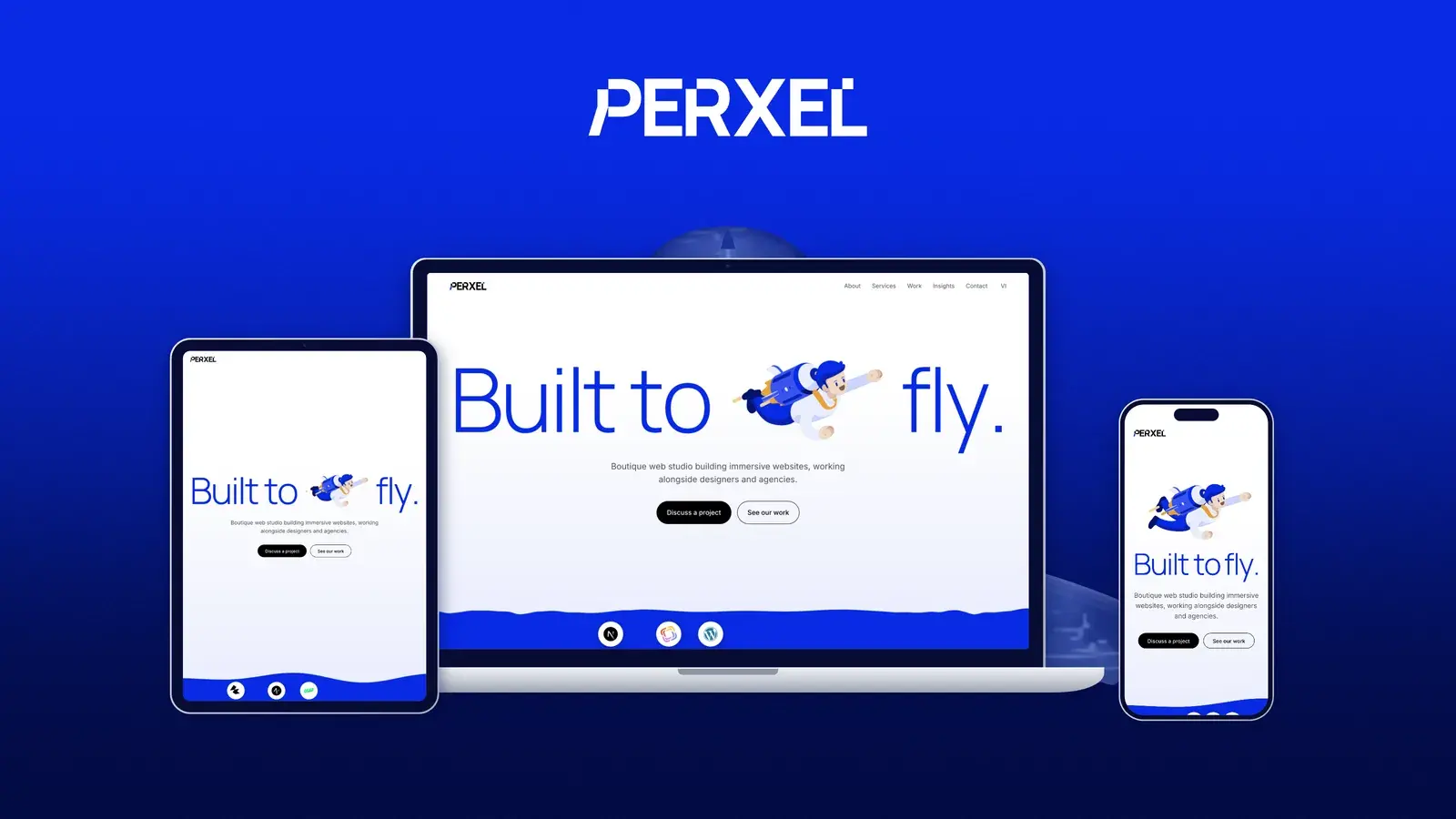
The Perxel 2026 website is a full rebuild of our site in Next.js, GSAP and Cloudflare Workers. On the homepage, water rises to cover the screen, a whale swims off into the deep, and a paper plane folds itself at the bottom of the page. The whole site is built around three things: water, flight and a character that plays the cursor. This post covers how we made each part, the ideas we tried and dropped, how we measured speed, and where the assets we didn't make come from.
The brief
We build websites for designers and agencies, so our own site is the first piece of work a client looks at. The rule from day one was to keep the site itself quiet: white background, light type, simple buttons. The homepage is the exception. It carries more motion, because it is where our animation work shows best.
The idea running through the site is water, flight and a character with a personality. Water is the material: the water edges, the letters that fill like bottles, the sea and the whale. Flight is the motion: the paper plane looping and landing, the whale gliding away, the project cards swimming across the screen like a fish. The character is the cursor, a water drop with two eyes that follows you through every page. Together they turn the homepage into one story instead of a string of separate effects.
The other requirement was that the animation must not slow the page down. A beautiful homepage that takes several seconds to show its first line of text is hard to admire. Our first version of the homepage made exactly that mistake. The "Keeping it fast" section below covers how we fixed it.
Stack
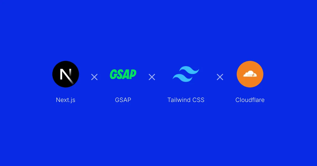
- Next.js 16 (App Router) and React 19 for the whole site, with posts written in MDX.
- Tailwind CSS 4 for styling.
- GSAP (ScrollTrigger) and Lenis for scroll: pinned screens, scroll-scrubbed timelines, smooth scrolling.
- Canvas for the image-heavy effects (water, the whale, the paper plane, the cursor). Drawn in code, they stay sharp at any size and we control every frame.
- Cloudflare Workers to run the site, built with OpenNext and deployed by GitHub Actions on every push to
main.
How the effects work
Rising water
Under the homepage headline sits a band of brand blue. Tech logos drop into it like marbles and rest on a water edge drawn on a canvas. Move the cursor across it and the surface ripples. As you scroll, the water rises to fill the screen, and the logos float up like bubbles until they cover the whole band in white. That white screen is also the background of the next section, so the two run into each other with no gap.
The water rises as you scroll, and the logos float up until the band turns white.
Bottles and a whale
The three big lines "With great design comes great engineering" are three bottles. As you scroll, each line fills with blue water in turn. The water has weight: scroll fast and the surface sloshes harder before it settles, and when a line is full a few droplets splash off the tops of the letters. Once full, the line sways gently like a water plant.
Each line fills with water as you scroll.
When the last line is full, the background turns into the sea. A humpback whale, seen from behind, swims away into the deep. It is drawn entirely in code, with no photo or video. Over the whole section the whale makes exactly one tail stroke, from the moment it appears to the moment it disappears. So whether you scroll fast or slow, it always swims the full distance.
The lines blur out and the whale swims off.
This is the part we rebuilt the most. Before the whale, the sea had cartoon fish and bubbles, then light patterns under the water, then ink that spread behind the cursor. The ink looked more like a storm than a sea, so it went. We also tried many ways for the lines to leave the screen: shrinking, sinking, dissolving into bubbles, tearing like wet paper. Every one of them looked fake, and the last one slowed the site down too. The current version is simpler: the letters blur out, then the whale swims away.
Project cards that swim
In the featured projects section, the cards don't just slide sideways. They bend along a wave that runs from the head of the row to its tail, like a swimming fish. The first version used flat cards turned in CSS 3D, but a flat card can't bend, so it looked nothing like a fish. We moved to canvas: each card is drawn as thin vertical slices, each one shifted and sheared along the wave, so the photo, the video and even the project name bend with it. The faster you scroll, the harder the row bends, then it eases back to a slow swim.
The row of cards bends with the wave as you scroll.
The paper plane
At the end of the homepage, a square of paper flips into the middle of the screen, folds itself into a paper plane, flies one loop and shrinks into its place. Scroll back and the plane unfolds. Once it is fully folded, it only plays forward and won't unfold again. The plane's shape is based on a 3D model by Trockk (see Credits). We used it as a reference and redrew every fold on a canvas.
The sheet folds itself into a plane, flies a round and lands.
A water drop for a cursor
The cursor is a water drop with two eyes. Over blue, it turns white and changes with the scene: a scuba diver, a goldfish, a jellyfish or a pufferfish. On the homepage, leave it still for a moment and it goes running, hopping, plays badminton or dives into a pool. On other pages it stays calm, so it doesn't pull attention from what you are reading.
Keeping it fast with all that motion
We measured with Lighthouse and PageSpeed Insights and fixed what the numbers showed, rather than guessing. On the mobile homepage, LCP went from 8.7 seconds to about 1.8 seconds and CLS from 0.9 to 0. The changes fall into four groups:
- UI: the headline shows with CSS instead of waiting for GSAP, layout starting states live in CSS, and phones get lighter versions of the heavy effects.
- Code: each page loads only the JavaScript it needs. The homepage's JavaScript went from 313 KB to 261 KB (brotli).
- Assets: fonts are self-hosted and cut to the Vietnamese character set, and images and videos are close to the size they're shown at.
- Hosting: a small Worker in front of the Next.js app answers prerendered pages, so the first request doesn't wait for the app to start.
How we did each one, with the numbers, is in Next.js performance.
The headline shows as soon as the page loads; the Lottie character comes in after.
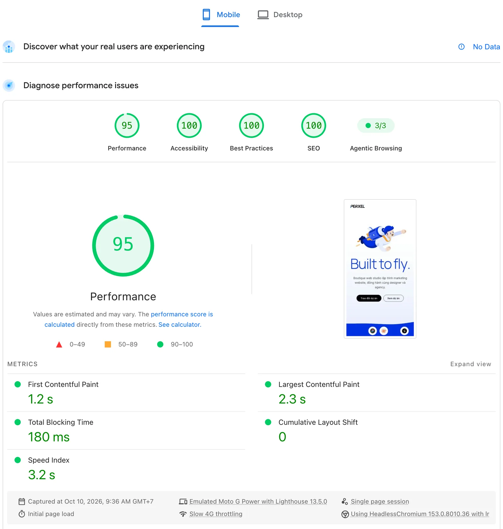
PageSpeed Insights on mobile, run on 10 October 2026 (emulated Moto G Power, Slow 4G).
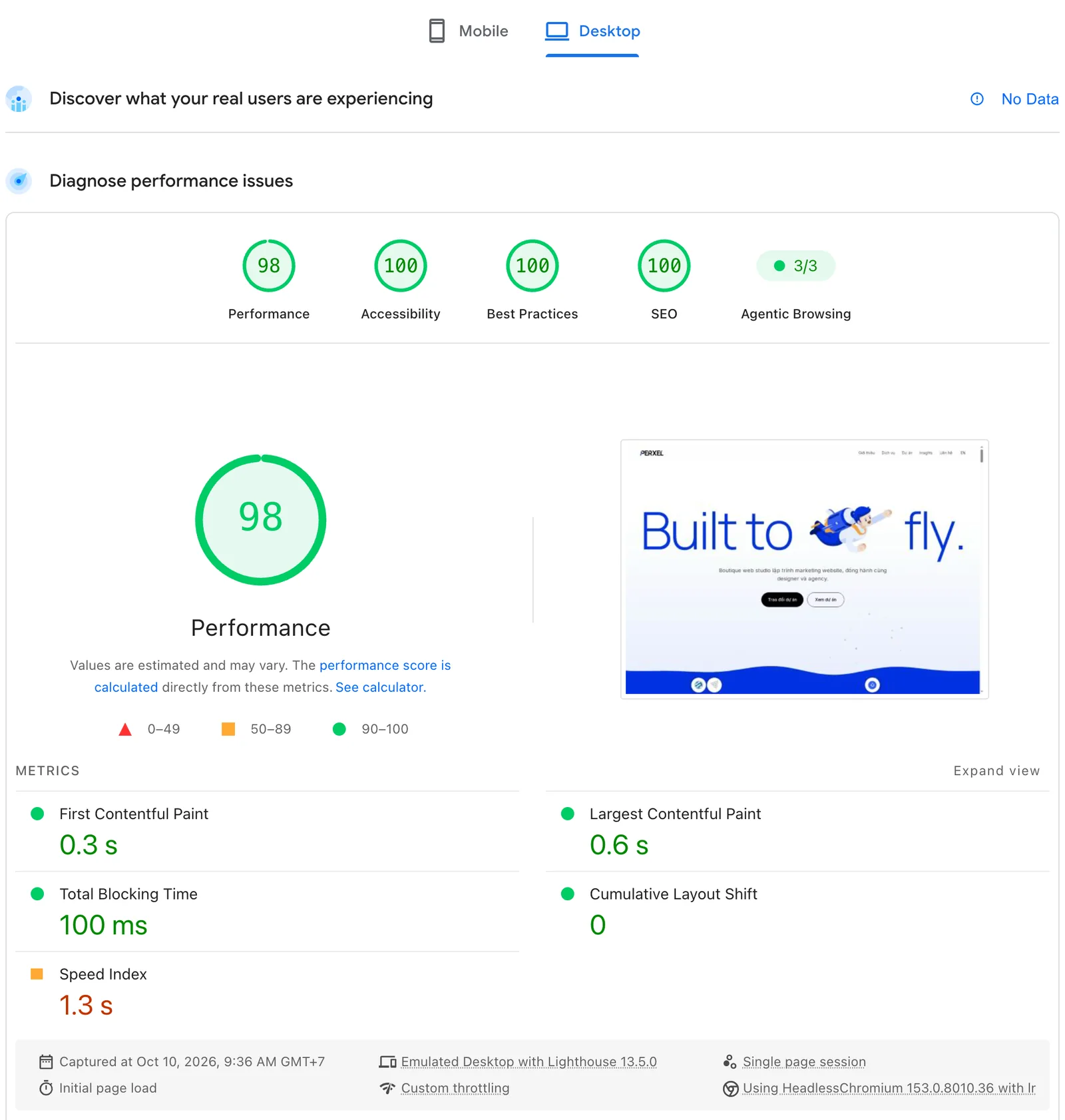
The same run on desktop.
Those two numbers come from a single lab run, so running it again can move them a lot: the same build scored only 68 on mobile the evening before. The part closer to what visitors actually get is "Discover what your real users are experiencing" at the top of the report, built from real Chrome users over 28 days. Our site still shows "No Data" there because it doesn't have enough visits yet. We go into how the two differ in PageSpeed Insights & Core Web Vitals.
We don't promise a score for any website, our own included, because the score depends on the content added later, the hosting and third parties such as analytics.
Hosting
The site runs on Cloudflare Workers, on the free plan. Thanks to Cloudflare for a stable edge platform with no fixed monthly cost.
Deploys go through GitHub Actions: every push to main builds with OpenNext and ships to Cloudflare. One detail is easy to trip on: Workers have no disk, so all content has to be listed at build time instead of read from a folder at runtime.
Unlike Vercel, Cloudflare doesn't serve prerendered pages without starting the Next.js app. On a low-traffic site, the first request can wait several seconds. We wrote a small Worker that sits in front and answers those pages; how it works is in the Hosting section of Next.js performance.
Credits
We didn't make the assets below. Thanks to their authors.
- The paper plane at the end of the homepage. "Paper Plane Asset" by Trockk, used under Creative Commons Attribution 4.0. We used the model for its shape and redrew the folds on a canvas.
- The illustration animations (Lottie). From LottieFiles, including artwork by Animoox. Each file was recoloured to the Perxel palette. How we did it is in our Lottie animation post.
- Cloudflare for hosting, as mentioned above.
FAQ
Can Perxel build effects like this for a client website?
Effects like the ones on this homepage take a lot of work and only make sense when the motion is the main point of the site. We can build them, but for most marketing websites a few well-chosen animations and a lean codebase serve the client better. We talk that through openly when we discuss the project.
Do you need GSAP and canvas for every animation?
Most of the animation on this site is still CSS or a plain Reveal entrance. Canvas and GSAP only appear where CSS can't do the job, such as the water, the whale and the bending cards.
What happens if someone turns animation off?
Browsers have a prefers-reduced-motion setting. When it is on, the homepage doesn't pin and skips the heavy effects: the lines show already full, the whale sits still in the distance, and the cursor goes back to the default. All the content is still there to read.
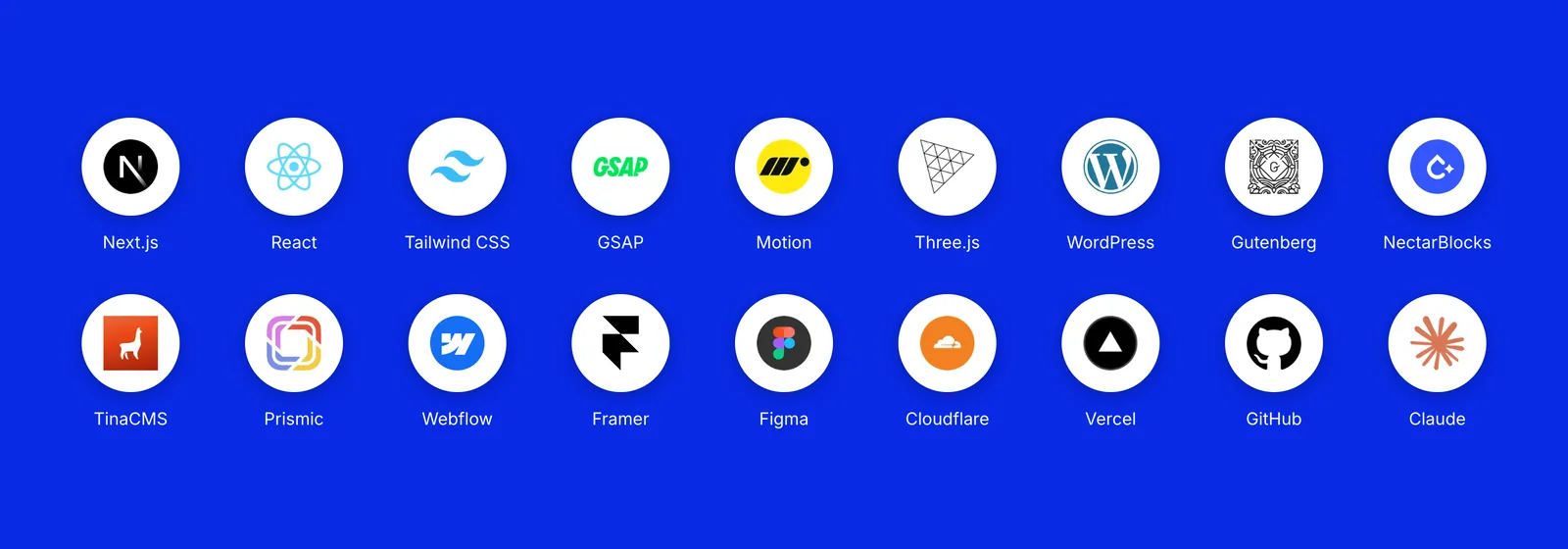
With animation off, the tech band becomes a grid of logos with names.
Footnotes
Want a quote?
Get in touch with Perxel today.